Wednesday, September 21, 2011

LRNZ.IT GOES LIVE.


Con un po' di emozione, è arrivato il momento di separarci.
Dopo diversi anni di onorato servizio, questo blog non è più il mio supporto prediletto stupendissimo.
Ho un sito nuovo di zecca.
http://www.lrnz.it.
E' un bel sito, si.
Su questo blog non pubblicherò altro che non siano link al mio nuovo sito.
Presto sarà possibile registrarsi al feed RSS anche lì, esattamente come su blogger. Userò ogni social network esistente per spammare gli aggiornamenti.
Quindi se mi aggiungete su Facebook, Twitter o G+ il gioco è fatto: LRNZ a domicilio in abbonamento perpetuo.
PS: se siete dei blog dipendenti POTETE USARE LA VISTA BLOG ANCHE SUL NUOVO SITO. Basta usare gli switch sotto l'interfaccia!
Ci vediamo su lrnz.it!

After a long and intense use of this blog, it's time to move on.
At last, I have a brand new website.
http://www.lrnz.it.
It too has a blog structure, but it's completely custom, with many many more features, starting with a much bigger space for images and a VERY cool homepage/dashboard.
Moreover if you love blogs nav style you can activate a nifty blog view.
RSS feeds will be active very soon and of course I will spread every single post on all the social networking platforms out there.
So add me on twitter, facebook or G+ and you're done.
See you there!

Wednesday, September 07, 2011

MIRIAM IN SIBERIA | VOL.2 LP COVER

Cover illustration for the forthcoming LP "Vol.2" by Miriam in Siberia.


ABC | ARTE BELLEZZA CULTURA


SNOB, through suggestion of Marcello Crescenzi commissioned me a cover illustration for a promotional printed set of the "ABC" project, by Regione Lazio.


We started with this blend of nature and art.
So you get this Roman head from Villa Adriana that reflects in the famous emperor's pool. Under the water and the reflection of trees and of the signature coumns of villa Adriana you can see fishes roaming free, and again the head symbolically reflected as Venus and knowledge are in the hermetic tradition that is so strong in roman classic art.
Leaves define the plane separating the underwater world.
Here is the final result:


Unfortunately, we have to agree that the solution lacked people in it, and it's to (young) people that the ABC project needs to arrive.


I started considering these two drafts as a starting point for a new take on the theme.
First one is a rush of people floating around ad sort of ISD made of art related items. Client loved the Festa del CInema di Roma poster I did a while ago and asked a take on the same vibe. While we lost nature we definitely gained people and action.
The second one is all about youth, arts, and nature living together in a beatiful landscape.
Freshest of the set, probably a bit on the edge to become off topic as a result.

So, the first one won in the end and here it is!


Will post the printed set as soon as I manage to get one!

KABOOM! | Fallout 3


Christian G. Marra of Passenger Press asked me to do this 24x17 piece about apocalypse in videogames, more specifically in Fallout 3. Destination: Bizzarro Magazine, Kaboom issue.
And now some extra contents! In between of the work:

My usually dirty draft. I generally lay down the final idea in the first 10 seconds of work.
As you can guess (not see, as it's VERY draft), there's a second guy on the back getting the nuka cola cap. This was my first concept of the work. Showed it to my friend Rrobe and he gave me the brilliant idea to eliminate the second character and let the bad guy interact with the spectator, throwing the cap towards the camera. That was a really smart solution and so I did (it even eliminates the need of a second character to draw, yessss!).

A first separation of the foreground drawing from the backdrop.
Lights are defined, some minor changes on the anatomy still have to occur.


Annnnnd: here is the final piece!
Can't wait to see the printed one.

Sunday, August 21, 2011

VISION TWO | OTOMO SHONEN - EARLY WORKS BY KATSUHIRO OTOMO


Here is the second cover I saw in my dream.
It is a collection of Otomo's early works.
Mostly black and white stuff.
The book was thick and covered in dark gray canvas.
One copy had that paper thing (obi) the japanese books usually have, but I can't remember perfectly.
Last thing: the covers are exactly the way I dreamed 'em. Far from me to think these are actually good covers. They are the faithful reproduction of the books I saw in my dream.
Hope you'll like it, anyway.
Don't forget to click the image to see it full size.

Thursday, August 18, 2011

VISION ONE | OTOMO / ANATOMY


I dreamt about Mr. Katsuhiro Otomo.
In the dream I was not self confident enough to speak to him so I only stared at Otomo from a distance while he was talking with his collaborators in the main hall of a old fashioned roman hotel.
During the meeting he was shuffling his new books on the table.
I could clearly see two books.
Here is the first one.
It was a book about Otomo's anatomy archetypes research made for Akira.
It is called OTOMO / ANATOMY.

Sorry for the cheap compositing, it's only a quickie, but I think it gets to the point.
Here is an in between.
Starting the second one now.

Tuesday, August 02, 2011

BATMAN | BORN AGAIN


More fake Batman.
Loved to develop more concept on this one.
A 2hrs all digital thing so no in between steps, sorry.

Expect a major color correction and detail fixing by tomorrow.

Another one and we're set.


Monday, August 01, 2011

Sunday, July 31, 2011

BATMAN | FINAL


Here it is: no more trash glowy moths and a more gentle and selective color correction.
Drawing at night can bring you to brutal color corrections :)


BATMAN MOCKUP


Click on the images to see 'em properly.
Finally had some time to finish.
It was a 12 hours thing, digital draft to coloured flat version.

Not very sure about some details. The glow on the moths is maybe too cheesy.
Maybe I will crank the brightness up a bit more. I love the fact you have to struggle to see Batman in the dark, but maybe I can just let him be a little more visible.
Tomorrow, maybe, I will post a more definitive version.

For sure I can do be faster AND better.
Anyway the Superamici logo on true a Batman cover should be there by default.

Batman is the best superhero to draw, no doubt.


Friday, July 29, 2011

NO TIME TO DRAW

is freaking me out.


BATMAAAAAAAAAAAAAAAAAAAAAANNNN.


Work in progress. Wished I could finish it today but didn't have the time to draw a lot.
Can't wait to colour it digitally.

Hope I can work on it more tomorrow and at least finish the pencil layer.
5:00 AM. Time to sleep.

Saturday, July 09, 2011

The Dark Side of the Sun: About noise and signal


I managed to finish this animated project called "the dark side of the sun".
I will make an extensive post about it soon.
Right now I have the urge to tell you what I discovered drawing for animation.
Basically, animation punishes you everytime you make a wrong choice of what it's really important and what's not.
Did you put a detail that wasn't necessary in your character design? Now draw it a thousand times!
It's like having a brutal old fashioned teacher sitting on your back!

That brought my style and the whole idea of drawing, expecially drawing characters, to a very new place.

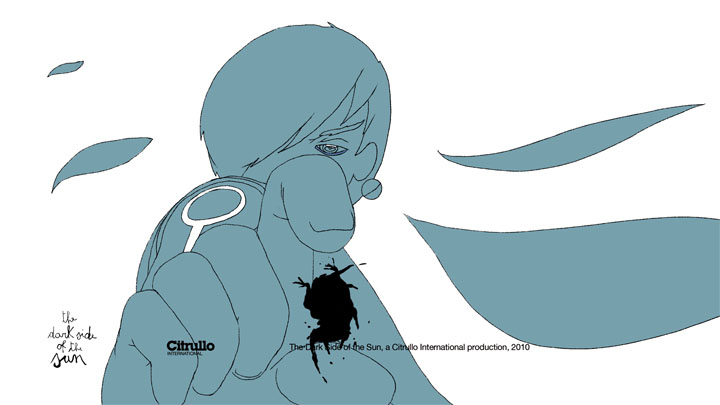
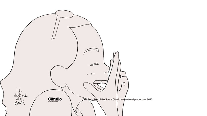
The images above are the key pose drawings I had to do to let the animators to their job without having to guess by trial and error how and what to draw. They are only a sample (I had to do many, MANY more drawings doing the preproduction) of what I discovered.

I'm very proud of the results, and it may seem stupid to you that I consider the drawing above the biggest step forward in style I've ever made in years, and probably the best drawings I've ever made. People usually like my work because it's very detailed and complex, so the drawings above may look cheap, worthless 10 minutes sketches (and I actually had 10/20 minutes to decide/do the shots so it's partly true :) ).

These drawings are very important to me for their consistency and, at last, a good balance between noise and signal: that's my only goal when I start a drawing, illustration or comic panel.

What's next? Using my new skills doing comics as soon as possible!